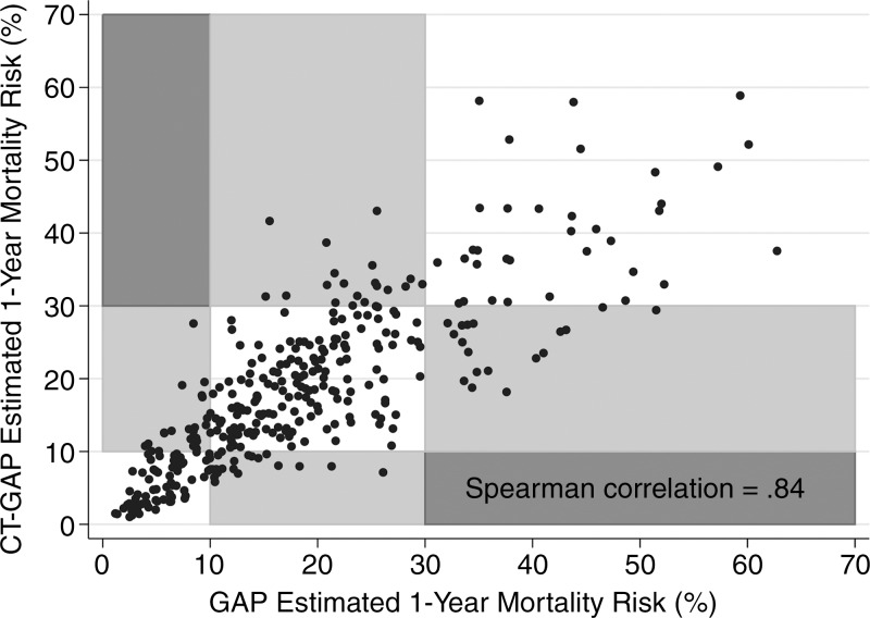
Figure 2:
Scatterplot shows correlation between CT-GAP–estimated and GAP-estimated risk of death. Grid boxes are shaded according to the shift in GAP stage between the two models. White boxes represent no shift in GAP stage between the two models, whereas light gray boxes represent a one-stage shift and dark gray boxes represent a two-stage shift. No patients were shifted two stages between the two models. GAP stage I = less than 10% risk of death in 1 year, GAP stage II = 10%–30% risk of death in 1 year, and GAP stage III = more than 30% risk of death in 1 year.

