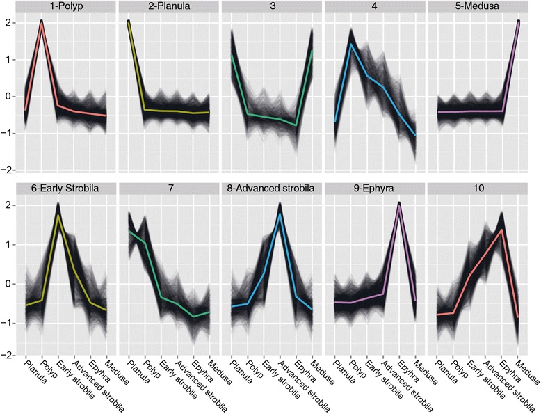
Figure 3.

Clustering profiles. Plots of k-mean profiles of the reduced set of transcripts with their centroids highlighted in color. The six clusters that were further analysed are marked near the profile number. The vertical axis represents relative transcript abundance, and the horizontal axis depicts the life-cycle stages.
