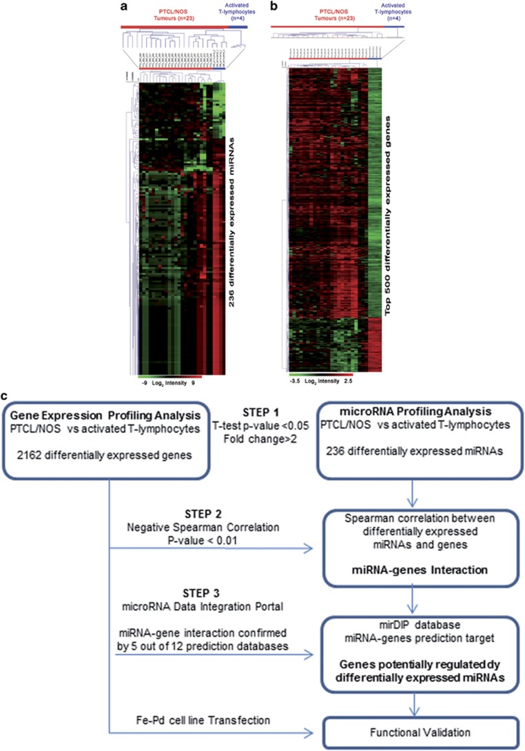
Figure 2.
Supervised analyses identified (a) differentially expressed miRNAs between PTCL/NOS and activated CD4+ and CD8+ T-lymphocytes. miRNAs with differences in expression were selected by the comparative cycling threshold methods (ΔΔCT) and filtered for statistical significance (two-tailed Student's t-test P-value <0.05 and FC >2). (b) Genes differentially expressed between PTCL/NOS and activated CD4+ and CD8+T-lymphocytes (t-test, P-value <0.05, FC >2, false discovery rate (FDR) adjusted Bonferroni correction). Top 500 genes in ranking are plotted. In the matrix, each row represents an miRNA/gene and each column represents a sample. The colour scale illustrates the relative expression level of an miRNA and genes across all samples: red represents an expression level above the mean and green represents expression lower than the mean. (c) Bioinformatic approach (three steps). Schematic representation of miRNA profiling and gene expression profiling data integration. The flow diagram is constituted by three steps indicated in the figure by three arrows.

