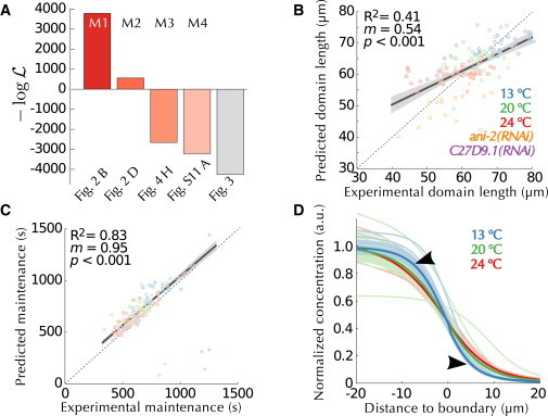
Figure 6.

Predictions of the mathematical model obtained from size and temperature perturbations. (A) Performance (negative log-likelihood score) of the successive modifications of the mathematical model with an indication of the model used (above) and of the corresponding figure panel (below). The right-most gray bar corresponds to optimization of each embryo individually (Fig. 3) and is displayed for comparison. (B) Comparison between the experimental data and the predictions of the optimized model (M4) when the size of each embryo is used (color-coded as indicated). (C) Comparison between the experimental quantification of the duration of the maintenance phase and the predictions of M4. (D) Maintenance profiles simulated by the optimized model at different temperatures, to be compared with Fig. 5E. To see this figure in color, go online.
