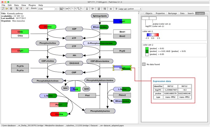
Fig 4. Multi-omics visualization in PathVisio.
Two transcriptomics datasets are visualized together with a metabolomics dataset on the Kennedy pathway from WikiPathways (http://www.wikipathways.org/instance/WP1771). The log2FC is visualized in the first column of the data node boxes using a gradient from blue over white to red. In the second column three levels of p-values are visualized (p-value < 0.01, < 0.05 and > 0.05). The expression data for a selected gene or metabolite is shown in the “Data” tab on the right side. In the red rectangle the expression data for the selected Cept1 gene is shown. There are two measurements for the gene from the two transcriptomics datasets, therefore the gene box in the pathway is split horizontally into two rows.

