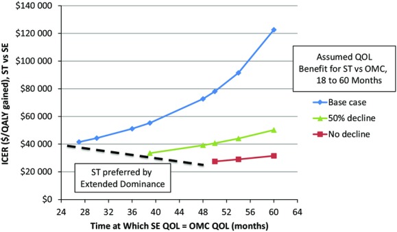
Figure 2.

Sensitivity analysis on the relative durability of QOL benefits. ICERs for ST vs SE are plotted on the y‐axis with varying assumptions about the durability of QOL benefit for each relative to OMC. The 3 lines represent 3 scenarios for ST: no decline in QOL over 5 years, a 50% decline, or full decline to the level of OMC. The number of months at which QOL with SE becomes equal to OMC is plotted on the x‐axis. For each ST scenario, a threshold can be defined at which ST is economically preferable to SE based on extended dominance (dashed line). ICERs indicates incremental cost‐effectiveness ratios; OMC, optimal medical care; QALY, quality adjusted life years; QOL, quality of life; SE, supervised exercise; ST, stenting.
