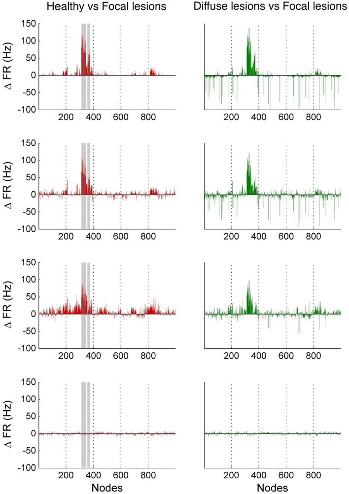
Figure 10.
Firing rate differences Δ FR between healthy and lesioned brains. The left-hand side shows the difference in mean firing rate between the healthy and focally lesioned networks (plotted on the y-axis) in the attractor state at each ROI (plotted on the x-axis), for the four noise amplitudes (in increasing order, starting at 0.01 on top to 0.1 at the bottom). The gray columns in the figures indicate the lesioned areas rCUN, rLOCC, and rPCUN. The right-hand side shows the same difference but for the diffuse vs. the focally lesioned network.

