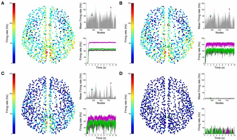
Figure 9.
Analysis of lesioned (diffuse) brain activity vs. noise. 2D plots for neural activity following a diffuse lesion for the same four simulation runs shown in Figure 8. Again, subplots (A–D) respectively refer to noise amplitudes 0.01, 0.05, 0.07, and 0.1. Each subplot shows three graphics: 2D distribution of nodes with activity indicated by colors from the color bar (warmer colors refer to higher activation and lesioned nodes are shown in black), mean firing rate for all nodes over the last 2 s of simulation and time-series signals extracted for the three seed ROIs rCAC (node 193, shown in black), rISTC (node 205, shown in green) and lPCUN (node 830, shown in magenta).

