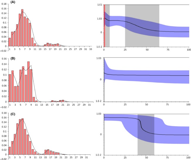
Figure 5.
Mismatch distribution and Bayesian skyline plots (BSP) analysis. (A) All samples. (B) D-unit. (C) U-unit. Pictures in left are results of mismatch distribution. The abscissa indicates the number of pairwise differences between compared sequences. The ordinate is the frequency for each value. Histograms are the observed frequencies of pairwise divergences among sequences and the line refers to the expectation under the model of population expansion. Pictures in right are results of BSP. The abscissa shows the time in millenniums of years ago (ka). The ordinate shows the estimated effective population size. Estimates of means are joined by a solid line while the shaded range delineates the 95% HPD limits. The gray dash areas represent timescale of the expansion events, and the red dash area represents timescale of the contraction event.

