
Figure 2.
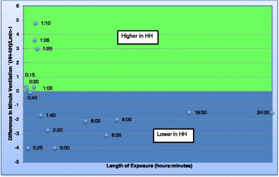
Graph of minute ventilation. Graph to show the difference in minute ventilation between the two environments over time. Each data point represents data obtained from a study and the number refers to the time point. If the data point is in the green area, the minute ventilation was found to be higher in HH but if in the blue area, the minute ventilation was found to be lower in HH.