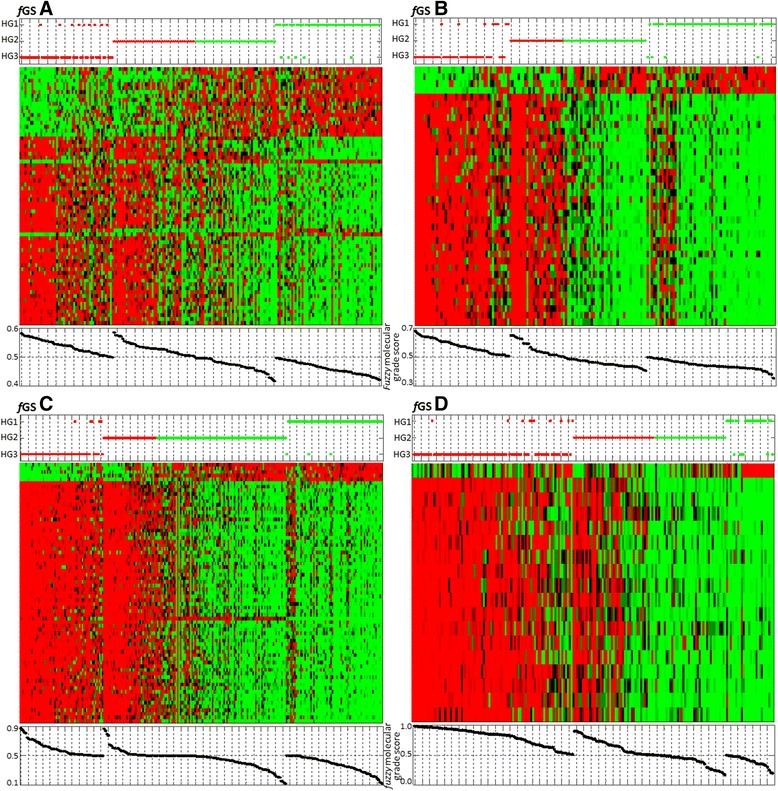
Figure 3.

Heat maps for fGS A, B, C and D in their corresponding training sets [ 16 , 14 , 13 , 6 ] . Each dataset was standardized along rows so that the mean is 0 and the standard deviation is 1. Red corresponds to positive expression values and green to negative expression values. Color intensity reflects the magnitude of expression relative to the mean. Rows correspond to gene probe sets, ranked in descending order (from bottom to top) according to MEMBAS feature selection algorithm. Columns of heat maps correspond to tumors, which were grouped according to their assigned molecular profile (LAMDA classification). TOP panel: Red dots = molecular grade 3 profile; green dots = molecular grade 1 profile. Vertical axis corresponds to tumors’ histologic grade (HG3, HG2 and HG1 from bottom to top). BOTTOM panel: Molecular Grade score of each tumor is plotted below the corresponding column.
