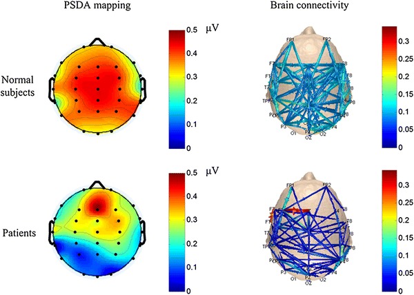
Fig. 3.

Average PSDA mappings and brain connectivity patterns. For the connectivity patterns, each edge of a connection is represented by curves with arrows that link one channel (source node) to another (sink node). The color and size of the curves indicate the strength normalization level of functional connectivity between channels
