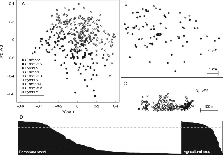
Fig. 2.
Results of cluster analyses. (A) Principal coordinates analysis scatterplot, with different shadings indicating different clusters according to STRUCTURE analysis and different symbols indicating morphological identification. (B) The same shading and symbol representation plotted on the geographical position of individuals, zooming in on the central Porporana stand (C). (D) Distribution of q values from STRUCTURE analysis for the Porporana stand (on the left) and the surrounding agricultural area (on the right). The black and white portions of each bar are the probabilities of belonging to cluster A and B, respectively. Grey dotted lines represent 0·8 thresholds applied for assignment to clusters A and B.

