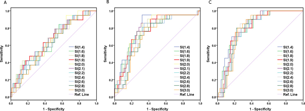
Figure 4. ROC Curves at 3 treatment time points for LC only.
ROC graphs only for local control (LC) at (A) pre-treatment, and (B) 2–2.5 weeks and (C) 4–4.5 weeks into treatment. To conserve space, only partial ROC curves are shown. The ROC graph of SI=1.9 (red) is also included to demonstrate its relationship and performance in comparison with other ROC curves. Overall, these ROC curves show a gross trend of gradual increase of AUC from A to B and C with the maximal AUC values of 0.66, 0.78 and 0.80, respectively, and the corresponding optimal SI thresholds values of 2.1, 2.1 and 2.0, respectively. Note that the thickest ROC curve (red) represents the universal SI=1.9, which shows an excellent overall performance (toward the left and top) compared to most of the other ROC curves.

