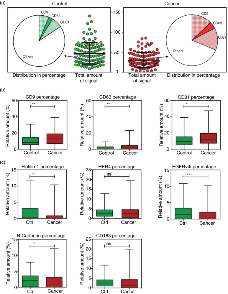
Fig. 3.
Normalisation of the data to the total amount of signal. a) The signals for all analytes were summed for each individual patient and plotted; controls indicated with green and cancer with red. For each individual patient the expression of the analytes were calculated as percentage of the total signal. The pie charts illustrate an example of the normalised data for a patient in each group with a total amount of signal of ~40. Highlighted is the expression of CD9, CD63 and CD81. b) and c) Box plot of the relative expression of markers from Figure 2a and b in percentage (in relation to the total sum of exosomal signal). *p <0.05; **p<0.01; ****p<0.0001; ns=not significant.

