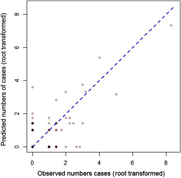
Figure 2.

Root transformed observed versus predicted numbers of cases per health facility. Counts were root transformed to aid visualisation. Points are plotted with transparent colours hence darker points indicate overlapping points. The blue dashed line corresponds to a 1:1 relationship.
