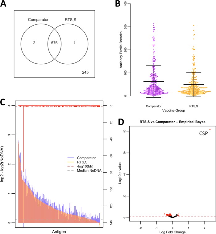
Fig. 2.
Antibody reactivity, breadth, and magnitude profiles by vaccination group. A Antigen reactivity between RTS,S and comparator vaccine groups is shown by Venn diagram with nonreactive antigens shown outside of the circles and shared antigens shown within the circles. B Antibody breadth profiles are shown in dotplots with measurements as antibody breadth scores (p < 1E-15). Means are displayed with standard deviation error bars. C A bar graph of antibody levels between vaccine groups is represented by colored overlapping bars for each antigen, sorted by antibody level in the RTS,S group, and the red bars on the alternative y axis represent inverse adjusted p values with the dashed red line representing the significance threshold. The gray dashed line represents median NoDNA levels. D The volcano plot shows inverse unadjusted p values plotted against fold change. Red dots appearing to the right of zerofold change represent significant antigens after adjustment favoring the RTS,S-vaccinated children, while those appearing to the left represent significant antigens after adjustment favoring the comparator vaccine immunized children. The red dashed line represent the threshold of statistical significance (p = 0.05).

