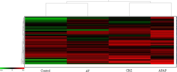
Fig. 4.
Hierarchical cluster analysis. Heat map showing the separation of the different experimental groups taking into account all altered proteins present in at least 75% of the spot maps and filtered by one-way ANOVA (p < 0.01). Every colored box represents a protein that is up-regulated (red) or down-regulated (green) in a certain treatment. The brighter the color, the more intense is the change.

