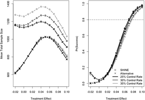
Figure 1.

Mean total sample size enrolled (left panel) and probability of trial success (right panel). SHINE is plotted with a circle and the Goldilocks is plotted with an x. Heavy line represents a control success rate of 25%, medium line represents a control success rate of 30%, and light line represents a control rate of 35%. Dashed line on the right panel shows 80% power for reference.
