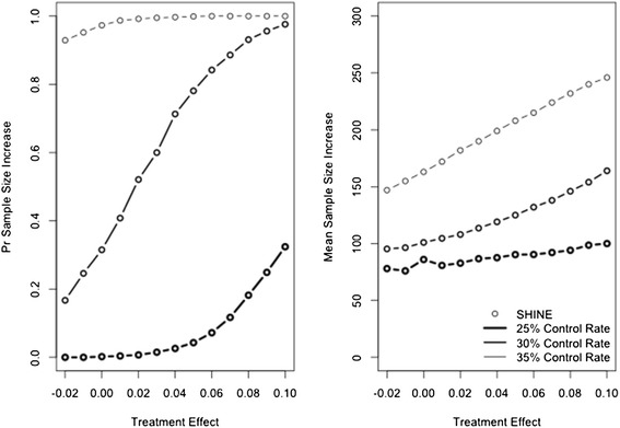
Figure 2.

Probability of increasing the maximum sample size (left panel) and mean number of patients added (right panel). SHINE is plotted with a circle (Goldilocks design does not include sample size re-estimation). Heavy line represents a control success rate of 25%, medium line represents a control success rate of 30%, and light line represents a control rate of 35%.
