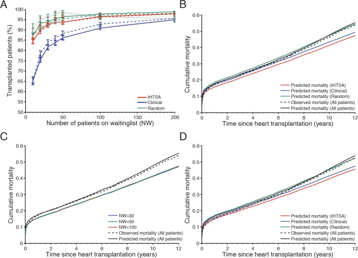
Fig 8. Predicted cumulative mortality for different organ allocation models.
In panel (A) the graph shows the number of transplanted patients for The IHTSA model (red lines), Clinical model (blue lines) and Control (green lines) influenced by the size of the waiting list. The internal validation cohort (IVC) is presented with solid lines, temporal validation cohort (TVC) dashed lines and external validation cohort NTTD dotted lines. In panel (B) the graph shows the difference in predicted cumulative mortality as a function of time since heart transplantation for a waiting list including 50 patients in the IVC (N = 8,569). The solid black lines present the observed mortality and the dotted lines the predicted mortality for all patients. Panel (C) shows the difference in predicted cumulative mortality for IHTSA model influenced by the number of patients on the waiting list (NW). In panel (D) the results from the sub analysis including patients from the IVC, who were not treated in the intensive care unit and were not on life support prior to transplantation, are presented (N = 4,868).

