
Fig. 2.

The black ROC curve with circles at diagnostic thresholds shows the data from Fig. 1, with AUC 0.83. The red curve with triangles describes the following data where test specificity is the same as in Fig. 1, but sensitivity has been increased. Here, assuming a rating of 3 or more conveys a diagnosis of cancer, then three positive cases are missed (sensitivity 94 %) and 17 negative cases are labeled positive (specificity 66 %); the AUC is 0.89:  The blue ROC curve with squares describes the following data where test sensitivity is the same as Fig. 1, but specificity has been increased. Here, assuming a rating of 3 or more conveys a diagnosis of cancer, then seven positive cases are missed (sensitivity 86 %) and eight negative cases are labeled positive (specificity 84 %); the AUC is 0.89:
 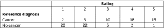 The black ROC curve with solid circles describes the following data where test sensitivity is increased to the same level as the red curve but with specificity dropped by a corresponding amount. Assuming a rating of 3 or more conveys a diagnosis of cancer, then just three cases are missed (sensitivity 94 %) but 47 negative cases are labelled positive (specificity 6 %). The empirical ROC AUC is 0.50 and the “curve” is actually a straight line: