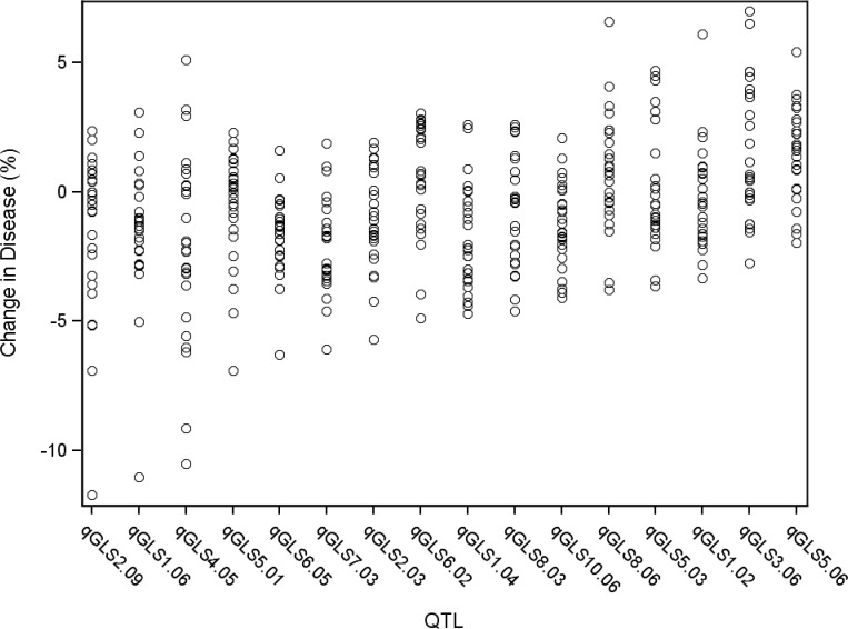
Fig 2. General linear model predicted percent change in disease across significant disease quantitative trait loci (QTL).
Each circle indicates the predicted change in disease of a single allele. There are 26 circles for each QTL, each representating the allele from one of the nested association mapping parental sources.

