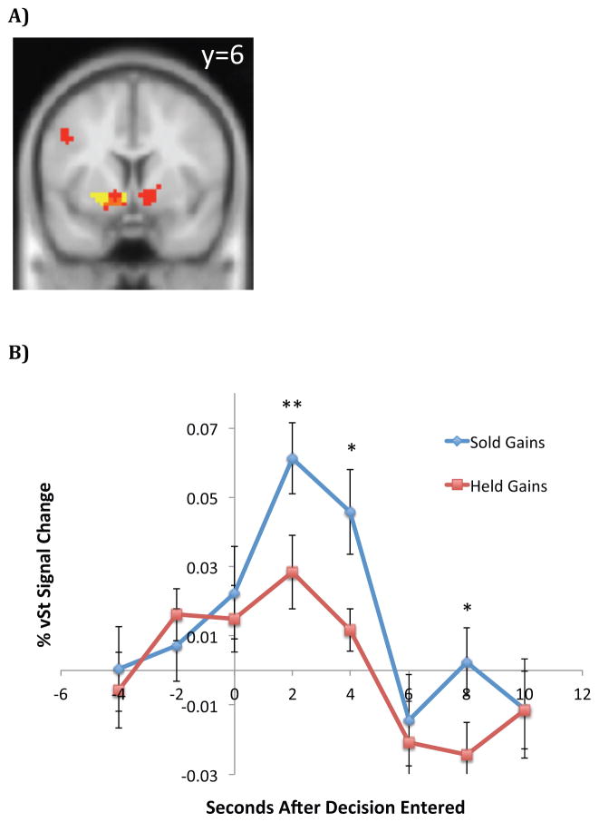
Figure 8. Direct tests of the realization utility hypothesis.
(A) Red voxels are those which exhibit greater activity when subjects realize capital gains compared to when they hold capital gains (shown at p<0.001 uncorrected with a 15 voxel extent threshold for illustrative purposes only). Yellow voxels indicate our a priori region of interest (ROI), which is based on peak voxels that correlate with prediction error in Lin et al. (2012) and an anatomical mask of vSt. Orange voxels indicate overlap between our a priori ROI and voxels which exhibit activity that correlates with realization of a capital gain. The y=6 coordinate indicates which 2-dimensional plane is shown in the brain map. (B) Activity in the vSt (averaged over a priori ROI) during trials when subjects were offered the opportunity to sell capital gains. The blue time series plots the average activity in trials where subjects realized capital gains, while the red time series plots the average activity in trials where subjects decided to hold capital gains. ** denotes p<0.01, * denotes p<0.05 (paired t-test). t=0 corresponds to the instant at which the subject enters his trading decision on a hand-held device.

