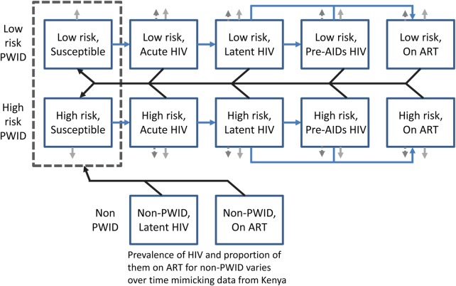
Figure 1.
Model schematic. The main model population subgroups are shown as blue squares. The blue lines denote transitions between people who inject drugs (PWID) HIV associated infection states, black lines show which groups can infect the susceptible PWID, and light grey arrows denote PWID leaving the model due to cessation of injecting (solid grey arrows) and HIV morbidity (dashed grey arrows). The dark dashed box denotes that the non-PWID can infect either low-risk or high-risk susceptible PWID. The inflows into the system are not shown but can either enter the susceptible or latent infected class depending on the prevalence of HIV among newly initiating PWID.

