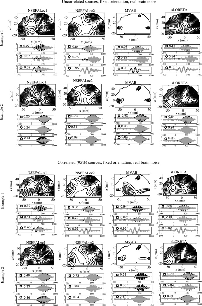
Fig. 3.
Performance of all methods in several example simulations. The top two examples all three true source locations, marked by square, diamond, and circle, are uncorrelated with each other. On the bottom half, the true sources labeled with squares indicate location of true sources highly correlated with each other, while the circle source is uncorrelated with the other two. While the source locations are the same for all examples, the time series are different for each. Intensity of map corresponds to normalized log-likelihood map for NSEFALoc1 and NSEFALoc2, and a normalized power map for MVAB and sLORETA. Below the localization map for each example, black lines indicate simulated time series for each of the three source locations; gray lines indicate estimates of the source time series at those three locations. The labels of squares, circles or diamonds are included in each time series plot to indicate correspondence with the location on the map. The correlation of the true time course and the estimated time course is shown next to the symbol within each time series plot.

