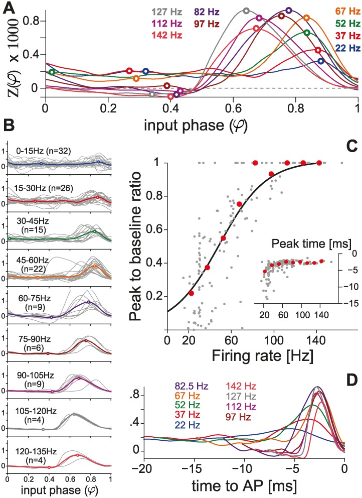
Fig 3. Population summary using the direct method.
(A) Population summary obtained over distinct firing rates, by averaging PRCs across individual cells. (B) Individual responses are plotted in gray and pooled according to the corresponding firing rate. Cell numbers are further indicated in parentheses. This summary, quantified by the peak-to-baseline ratio as in Fig. 2C (individual cells, n = 42: gray markers; averages from A: red markers), confirms (C) our observations in single PCs (Fig. 2). The black curve represents the function (1 + e −(F−a)/b)−1, with best-fit parameters a = 47.6, b = 21.7 optimized over the set of 42 PCs. The inset further displays the location of the summary PRCs peak, relative to the time of the AP following the stimulus (i.e., τ peak = (φ peak − 1) ⋅ ⟨ISI⟩), as in Fig. 2B. (D) The average PRCs are equivalently represented as a function of time (i.e., τ = (φ − 1) ⋅ ⟨ISI⟩) for the 20 ms preceding the perturbed AP.

