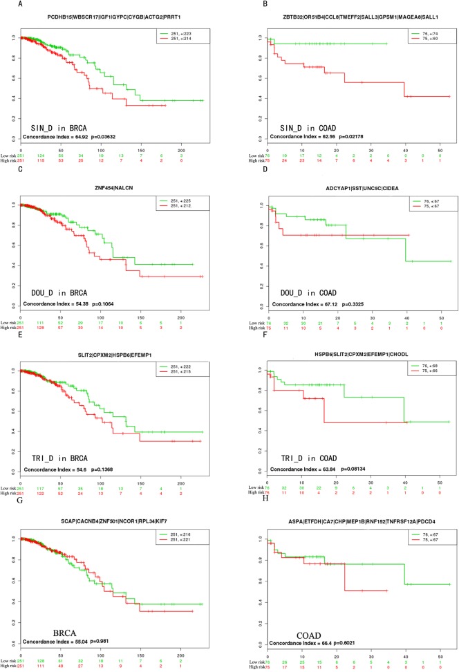
Fig 5. The survival analysis of candidate biomarkers.
The “+” stood for the censoring samples. The X axis and Y axis respectively stood for observation time (months) and percent of survival people. Red and Green curves were high-risk group and low-risk group. The biomarkers were on the top of every picture. Concordance Index (CI) and p-value were in the bottom-left insets.

