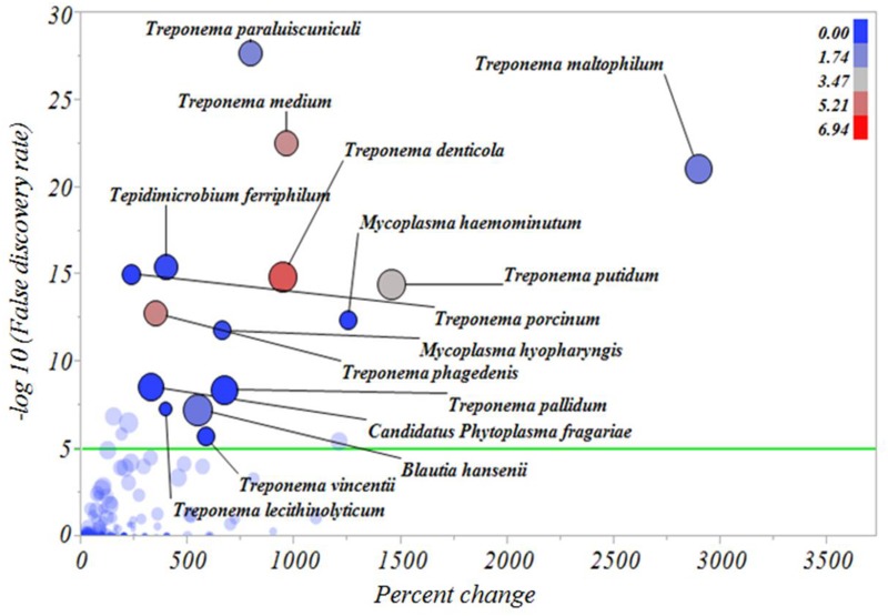
Fig 7. Percentage increase of bacterial types from inactive digital dermatitis lesions to active digital dermatitis lesions.
The Y axis represents the robust LogWorth of the false discovery rate and the X axis represents the percentage increase in relative abundance when comparing inactive digital dermatitis lesions to active digital dermatitis lesions. The sizes of the circles represent the effect size and the colors represent the relative abundance of each individual bacterial type in active digital dermatitis lesions (color legend upper right corner). Green line represents P < 0.00005.

