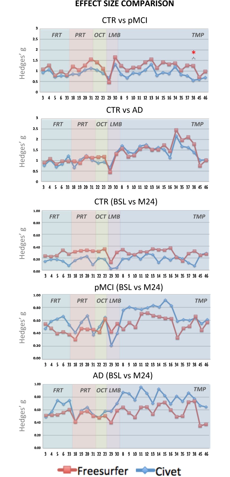
Fig 4. Hedges’ g effect size graphs in the different ROI areas.
The first two panels represent the cross-sectional effect sizes comparing the overall trend of CTR versus pMCI, and of CTR versus AD. The remaining three panels represent the longitudinal effect sizes between the baseline and month 24 in CTR, pMCI, and AD groups. The * symbol stands for p<0.05.

