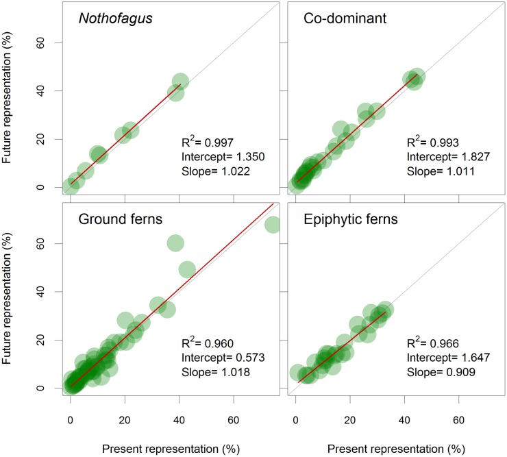
Fig 4. Expected changes for all the species group representation.
Gray diagonal lines show no change in representation in NPA, circles under the lines represent expected shrinkages in NPA representation, while circles above the lines depict expected increases in representation in NPA. Red lines represent fitted linear models for each species group with their correlation, intercept and slope data.

