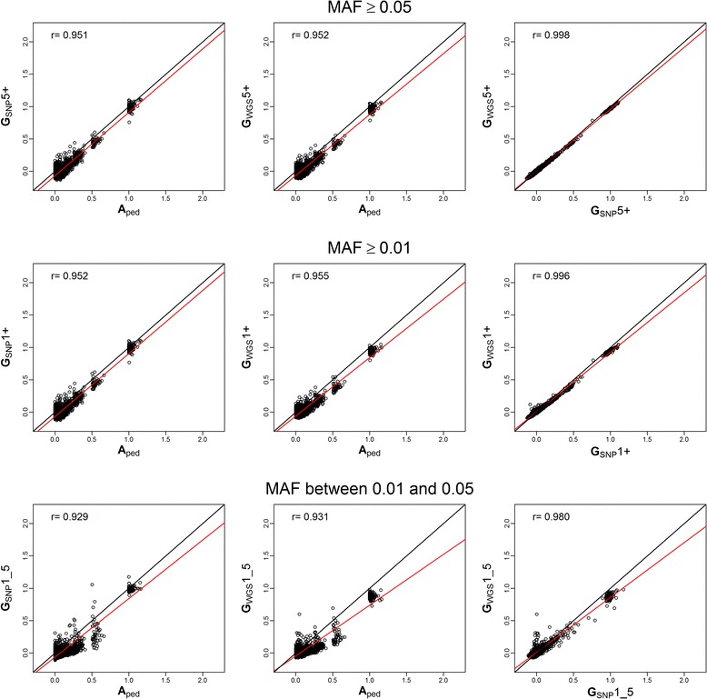
Figure 2.

Linear regressions plots for A , SNP and WGS against each other ( Yang method ) . Plots of linear regressions of A estimated relationships from pedigree (A ped), G estimated relationships for Single Nucleotide Polymorphism (G SNP) and whole genome sequence (G WGS) data using the Yang method. Each linear regression was performed for the scenarios with Minor Allele Frequency (MAF) ≥ 5% (5+), ≥ 1% (1+) and between 1% and 5% (1_5). The first row represents the plots for scenario +5, the second for +1 and the third for 1_5. The first column shows the linear regression plots of G SNP on A ped. The second column shows the linear regression plots of G WGS on A ped. The third shows the linear regression plots of G WGS on G SNP. In black is the regression line for an exact linear model (intercept=0, slope=1) and in red is the actual overall regression line. On the top left corner, the overall correlation coefficient for each linear regression appears.
