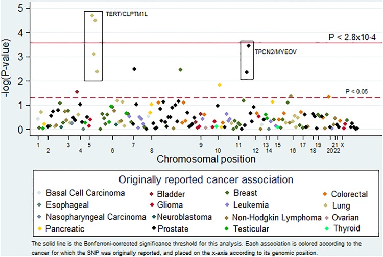
Fig 1. Pleiotropy-colored Manhattan plot.
This plot shows the inverse log of the P-value for the association between melanoma and SNPs previously associated with cancer. The solid line represents the Bonferroni-corrected significance threshold for this analysis (0.05/181 = 2.8x10⁻⁴). Each association is colored according to the cancer for which the SNP was originally reported, and placed on the x-axis according to its genomic position.

