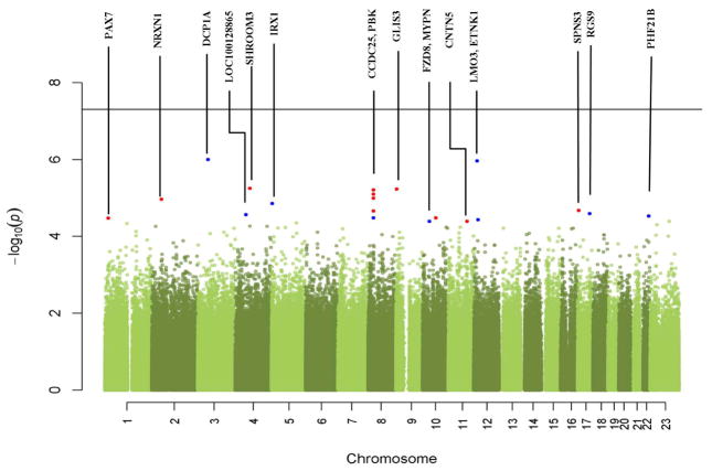
Figure 1. Manhattan plot from the maternal genome-wide association tests.
The -log10(p-value) of each SNP from the association test is plotted relative to its position on each chromosome. Red dots represent top candidate SNPs within known genes (labeled). Blue dots represent top SNPs near known genes. The horizontal line indicates the threshold for genome-wide significance (5E-8).

