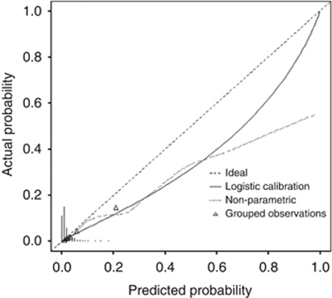
Figure 3.
Calibration plot of the internal and external validation cohorts. The x axis shows the prediction calculated using the nomogram, and the y axis shows the observed rates of synchronous metastases for patients in the IGR cohort. The dashed line is the reference line, where an ideal nomogram would lie. The solid line indicates the performance of the IGR nomogram applied to the validation cohort. The solid line is not close to the dashed line of the ideal nomogram and is not always within the 10% margin of error.

