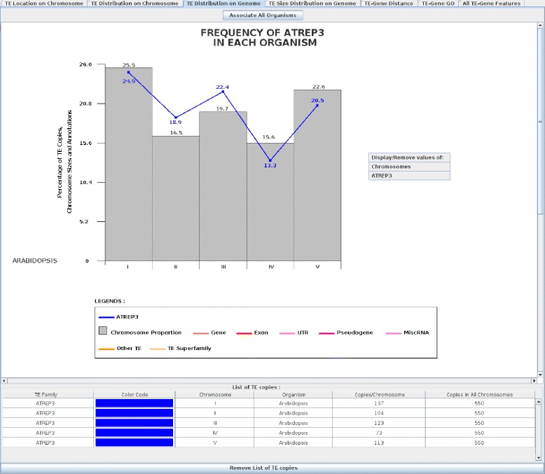
Figure 3.

AtREP3 frequency in Arabidopsis thaliana . The top graphical part displays a histogram where each bar corresponds to the proportion of each chromosome size (grey bar). The blue curve is the AtREP3 distribution where each curve point corresponds to the percentage of AtREP3 copies in the Arabidopsis chromosomes. The ‘Associate Sequences’ button associates all histogram genomes into one histogram and vice versa (‘Dissociate Sequences’ button). The bottom graphical part displays a list of TEs with the number of copies on each chromosome and the total number of copies in A. thaliana. The ‘Remove List of TE copies’ button allows the TE list to be removed for better visualization of the histogram.
