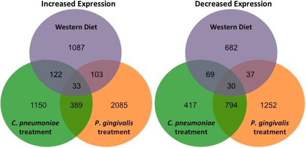
Figure 1.

Chronic time point Venn diagrams. Venn diagrams depicting the number of genes with significantly increased (left) or significantly decreased (right) expression vs. the chronic control group for each chronic treatment group. The sets of differentially expressed genes result from differential expression analyses for each chronic treatment group vs. the chronic control group using the R environment for statistical computing (version 2.15.1) with a cut off of FDR q < 0.25 as described in Methods.
