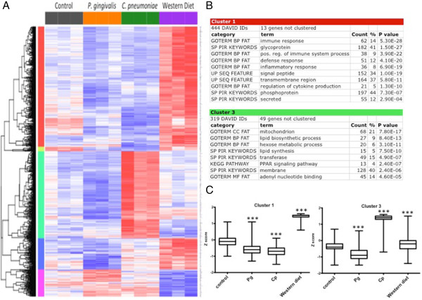
Figure 2.

Chronic time point cluster analysis. The top 1000 differentially expressed genes at the chronic time point with 5 distinct clusters. A. Heat map shows relative expression among all groups. Clusters are color-coded by row sidebars: red (cluster 1), chartreuse (cluster 2), mint green (cluster 3), blue (cluster 4), and magenta (cluster 5); and dendrogram is left of the color-coded sidebars. Each row corresponds to a gene (gene symbols are listed to the right of each row) and each column to a sample. The colors are scaled by row; red and blue indicate 2 standard deviations above or below the mean (white), respectively. At the arbitrary cutoff of 1000 genes, the chronic time point one-way ANOVA FDR q value was < 0.019 and the p value was < 8.73 × 10⁻⁴. B. DAVID analysis of clusters 1 and 3. Gene enrichment is indicated by p values (EASE scores, a modified Fisher exact p value). C. Box and whisker plots of the mean expression (log2) for Clusters 1 and 3 reflect patterns seen on heat map. *** = p < 0.0001 chronic treatment group vs. chronic control group by Mann-Whitney test.
