
Figure 6.
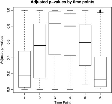
Box plot showing p-values at the six different time points comparing the ex vivo and in vitro experiments. The boxes are higher in the middle, reflecting the larger p-values and the fact that the gene expression patterns are more similar for time points three and four.