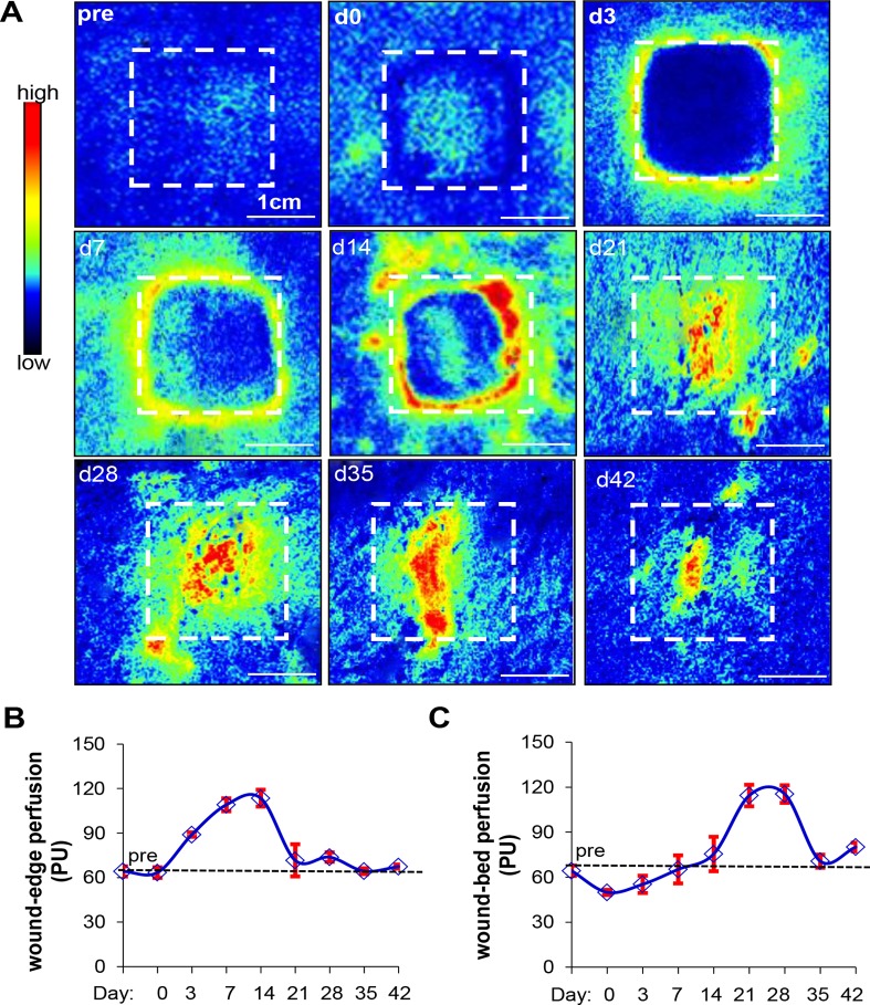
Fig 3. Laser speckle perfusion imaging shows dynamic changes in wound-site blood flow over time.
(A) Perfusion was visualized as a two-dimensional color-coded map of blood flow (red = high; blue = low). Perfusion maps were acquired for all time points. A hashed line box representing the original wound size (1”x1”) was drawn on perfusion images to show changes in perfusion and wound size over time. (B and C) Mean perfusion at the wound edge (B) and wound bed (C) from all the time points are shown in the line graph. Data represent mean ± SD. (Scale bar = 1cm). (n = 3 pigs).

