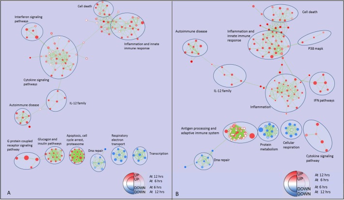
Fig 2. Enrichment map for M1 vs RM at 6, 12 and 24 hours.
Panel A: the map displays the enriched pathways (p-value < 0.01, FDR < 20%), issued from GSEA, in M1 vs RM at 6 and 12 hours of culture. Enrichments were mapped to the inner node area and to the node borders, respectively. Panel B: the map displays the enriched pathways in M1 vs RM at 12 and 24 hours of culture. Enrichments were mapped to the inner node area and to the node borders, respectively. Red and blue dots represent up- and down-regulated gene-sets respectively, in M1 vs. RM. Edge thickness represents the fraction of common genes between pathways.

