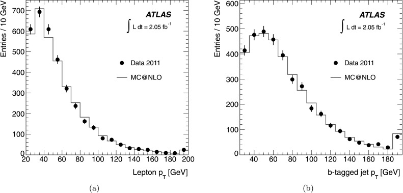
Fig. 1.

The distribution of (a) lepton p
T and (b) b-tagged jet p
T for the selected events compared to the MC@NLO simulation of  events. The data is shown as closed (black) circles with the statistical uncertainty. The MC@NLO prediction is normalised to the data and is shown as a solid (red) line. The overflow events at high p
T are added into the final bin of each histogram (Color figure online)
