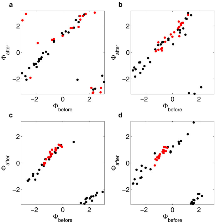
Figure 3. Phases before and after perturbations.

Graphs showing the phases 9 s after cyanide removal/flow change as a function of the phases just before the removal/flow change for perturbations 1, 2, 4 and 8 in panel (a)–(d) respectively. Data from experiments where cells were entrained by cyanide removal is shown in red (N = 20), while data from control experiments where only the flow rates were changed is shown in black (N = 32). In panel (a) it can be seen that the phases before the first perturbation are evenly distributed for both data sets. In panels (b)–(d), the phases of cells in the control experiments remain evenly distributed, while the distribution of phases of cells experiencing cyanide removal narrows to about 20% of the original distribution after perturbation 8. The graphs show that synchronising phase shifts are induced in the experiment where cyanide is removed and that most of the synchronising shifts occur at the first perturbations. For the control experiment, on the other hand, no phase shift dependence on the phase can be seen.
