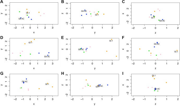
Fig 9. Evolving IgG responses to virus-like particles throughout the time course of the study.
Individual points represent VLPs, and the distances between points represent the overall differences in the magnitude of IgG responses from all ten participants against these NoV VLPs on day 0 (A–C), day 7 (D–F), and day 180 (G–I). Specifically, the distance between VLPs (with each unit in any dimension [D] relating to a 3.4-fold difference in total IgG responses) shows how similar total IgG responses across the ten participants were to each pair of VLPs tested within this study and how vaccine components (noted in each panel) cluster with other NoV strain VLPs. Despite similarities across these responses, we are able to show that GI VLPs (orange) cluster with the GI.1 vaccine component, early GII.4 VLPs (blue) cluster with the GII.4C vaccine component, and late GII.4 VLPs (green) and the other GII VLPs (pink) cluster together and away from the other VLPs. For each time point, the x-axis is that showing the most variation between all VLPs, then the y-axis, then the z-axis. Therefore, down each column, we can see how immune responses change and track through the time course of the study. Of note are the clusterings of each virus subtype through these responses.

