
Figure 4.
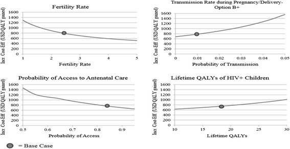
One-way sensitivity analyses. Each graph indicates the change in the incremental cost-effectiveness ratio (ICER) between Option B and Option B+ when a single variable’s value is changed. The “base case” scenario is indicated with a circle. A downward-sloping line indicates Option B+ is becoming more cost-effective as the variable’s value is increased, while an upward-sloping line indicates Option B+ is becoming less cost-effective as the variable’s value is increased. The curve of each line indicates the specific rate at which the ICER changes as the variable’s value is altered.