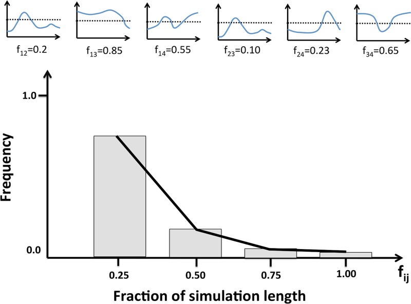
Fig 4. Persistence along time of the cavity correlations in a protein.
The figure illustrates how we turned the correlation vs. time plots in Fig. 3 into a simpler representation allowing to summarize in a single plot the data for all the cavity pairs in a protein. The small graphs in the upper part of the figure represent the variation of cavity correlation with time for each of the cavity pairs in a protein: 1–2, 1–3, 1–4, 2–3, etc. For each of them we computed the fraction of time (fij, for pair Ci-Cj) for which the correlation was above a given threshold. Two different values of the threshold, 0.25 and 0.5, were tried in our analyses. Finally, we represented the distribution of these fij values using a standard frequency histogram.

