
Figure 2.
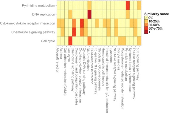
Example of Jplot. Input: two DAVID annotation charts objects. The Jplot builds a heatmap showing how similar are the annotations found using different gene lists. The similarity is based on the Jaccard’s coefficient; it is compiled between each pair of annotations x and y, where x and y can be associated, for instance, to two GO-terms or KEGG pathways.