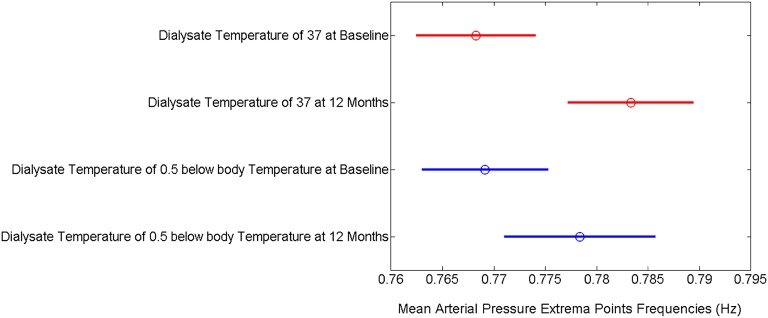
Figure 4.
A graphical representation of repeated measures ANOVA of the frequencies of the mean arterial BP extrema points across all groups at baseline and follow-up. The circles represent the means of the frequencies of the extrema points for mean arterial BP. The lines represent confidence intervals.

