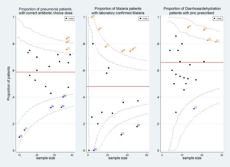
Fig 4. Variability of hospital performance across indicators.
Variability funnel plots: X axis represents number of cases available for the indicator per hospital, Y axis represents the proportion of patients that achieve the indicator per hospital while the numbers against the data points are the hospital identifiers. The red line is the mean performance across hospitals while the dashed lines represent the 95% and 99% confidence intervals.

