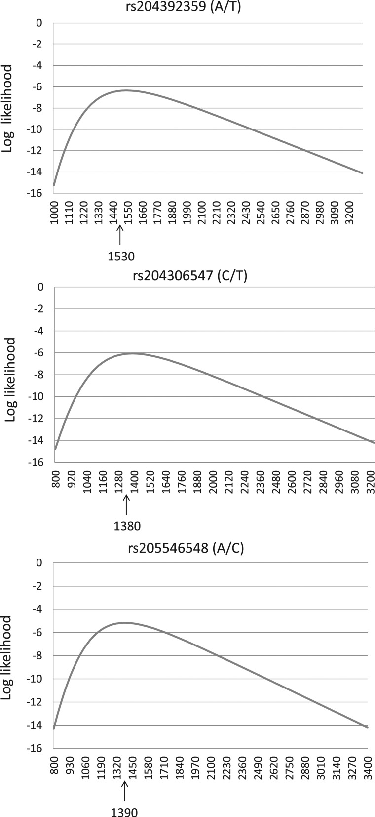
Figure 6.
Distribution of likelihoods of allele age (generations ago) of the mutation (SNP) in the microsatellite sequences. The SNP IDs along with their alleles are shown above the graphs. The x-axis represents time (in generations) when the mutation likely occurred, and the corresponding estimates of likelihoods are shown in the y-axis. The specific generation time when the likelihood value is highest is indicated by an upward arrow.

